6 Composition
Understanding Composition
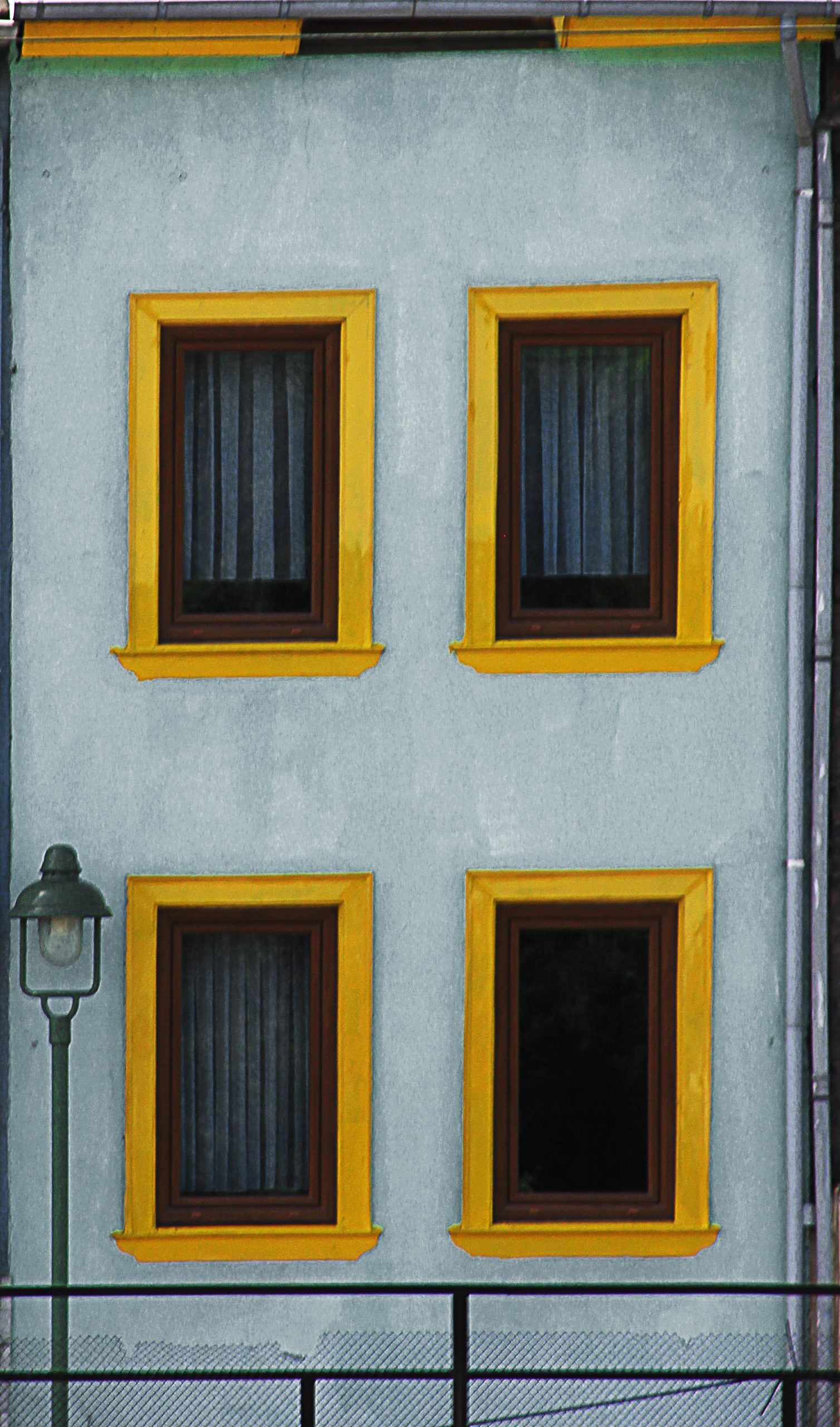
Composition is the arrangement of elements within a photograph. It is a fundamental aspect of photography that can make the difference between a good shot and a great one. By mastering various compositional techniques, you can create visually engaging and impactful images. In this chapter, we will explore ten main types of composition: Rule of Thirds, Framing, Repetition, Fill the Frame, Balancing Elements, Symmetry, Leading Lines, Depth (Layers), Triangles and Diagonals, and Patterns. Alongside, we plan to build on what we have learned in our previous lesson by discussing how to use color to enhance these compositions.
Types of Composition
1. Rule of Thirds

The Rule of Thirds divides the frame into nine equal parts using two horizontal and two vertical lines. Placing your subject along these lines or at their intersections can create a balanced and interesting composition. Photo by Eric Demattos CC BY-NC-SA (Attribution Non Commercial ShareAlike)
Exercise:
- Objective: Capture a landscape photo using the Rule of Thirds.
- Steps:
- Find a scenic location.
- Imagine a grid dividing the frame into nine equal parts. Most cameras allow you to set a visible rule of thirds grid in your viewfinder to help you compose your shots.
- Position the horizon along the top or bottom third.
- Place a focal point (like a tree or person) at one of the intersections.
- Take the shot.
- Mindful of color: One approach to guide the viewer’s eye is by using contrasting colors at key intersections to highlight focal points. Alternatively, a harmonious color palette can draw attention subtly, allowing the uniqueness of the object in the 1/3 position to naturally stand out.

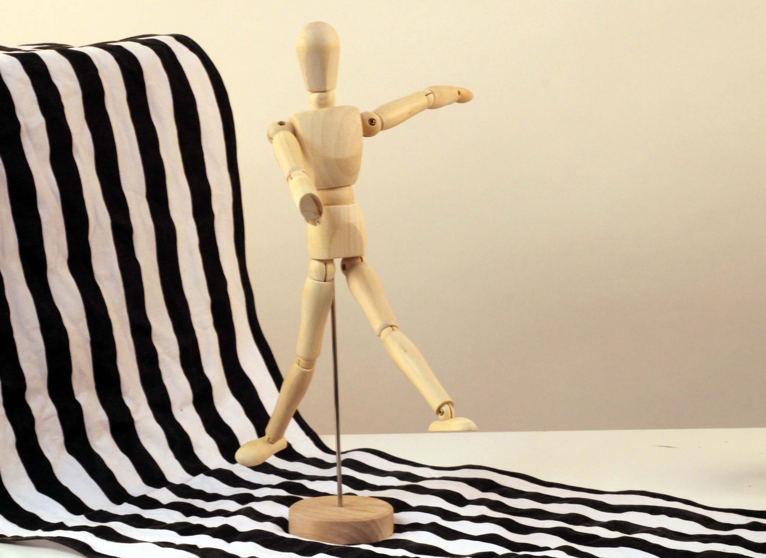
In this image, the subject—a life-sized wooden mannequin—is positioned at the intersection of the right-side gridlines, following the rule of thirds for balanced composition. Photo by Eric Demattos CC BY-NC-SA (Attribution Non Commercial ShareAlike)
2. Framing

Framing involves using elements within the scene to create a “frame” around your subject. This technique draws attention to the subject and adds depth to the image.
Exercise:
- Objective: Use natural elements to frame a subject.
- Steps:
- Find a subject, such as a building or person.
- Look for natural frames like archways, windows, or tree branches.
- Position the subject within the frame.
- Take the shot.
- Mindful of Color: Choose frames that contrast or complement the subject’s color to enhance the visual impact.

3. Repetition

Repetition involves capturing a pattern of repeating elements to create a sense of rhythm and unity in the composition.
Exercise:
- Objective: Capture a series of repeating elements.
- Steps:
- Find a scene with repeating elements (e.g., fence posts, windows).
- Align your shot to emphasize the repetition.
- Take the shot.
- Mindful of Color: Use repeating colors to enhance the sense of rhythm.

4. Fill the Frame

Filling the frame means getting close to your subject in order to eliminate any distracting background. This technique emphasizes details and textures.
Exercise:
- Objective: Capture a close-up of a textured subject.
- Steps:
- Find a subject with interesting textures (e.g., a flower, a textured wall).
- Get close to the subject, filling the entire frame.
- Take the shot.
- Mindful of Color: Focus on vibrant colors and textures to make the subject stand out.

Can you guess what this is? It’s the front of an old snow removal train car. While the train as a whole was an interesting subject, zooming in on the intricate pattern and detail of its snow removal blades created a more compelling image. By filling the frame with this specific part of the machinery, the viewer is drawn to focus on its unique and captivating design. Photo by Eric Demattos CC BY-NC-SA (Attribution Non Commercial ShareAlike)
5. Balancing Elements

Balancing elements involves positioning subjects within the frame so that they create a harmonious balance. This can be achieved by placing a subject off-center and balancing it with a less dominant element. Visual balance in an image is like balancing a seesaw: imagine a dividing line down the middle of your image, with a fulcrum at the center. A larger object near the center can balance a smaller object at the edge.
Exercise:
- Objective: Create a balanced composition with two subjects.
- Steps:
- Find two subjects of differing sizes (e.g., a large tree and a smaller bush).
- Place the larger subject off-center.
- Position the smaller subject on the opposite side to balance the composition.
- Take the shot.
- Mindful of Color: Balance contrasting colors for visual harmony.

In this image, I positioned a tricycle in the foreground to balance the abandoned schoolhouse in the background. By dividing the picture plane in half and distributing objects with equal visual weight on either side, the composition achieves a harmonious balance. The visual weight of the puddle’s edge, along with the grass, weeds, and schoolhouse, counterbalances the larger tricycle in the foreground, creating a cohesive and visually engaging scene. Photo by Eric Demattos CC BY-NC-SA (Attribution Non Commercial ShareAlike)
6. Symmetry

Symmetry involves creating a balanced and harmonious composition by mirroring elements on either side of a central axis.
Exercise:
- Objective: Capture a symmetrical scene.
- Steps:
- Find a symmetrical scene (e.g., a building with symmetrical architecture).
- Align your camera with the central axis of the symmetry.
- Take the shot.
- Mindful of Color: Use symmetrical color patterns to enhance the symmetry.

Although the overall scene lacks perfect symmetry, I positioned myself in alignment with the building’s symmetrical design, ensuring the windows and doors mirrored each other on either side. This approach creates a symmetrical composition centered around the subject of the image. Photo by Eric Demattos CC BY-NC-SA (Attribution Non Commercial ShareAlike)
7. Leading Lines

Leading lines guide the viewer’s eye through the image and towards the main subject. These lines can be natural or man-made.
Exercise:
- Objective: Use leading lines to draw attention to a subject.
- Steps:
- Find a scene with leading lines (e.g., a road, a path, or a river).
- Position the subject at the end of the lines.
- Take the shot.
- Mindful of Color: Use lines of contrasting color to guide the eye.
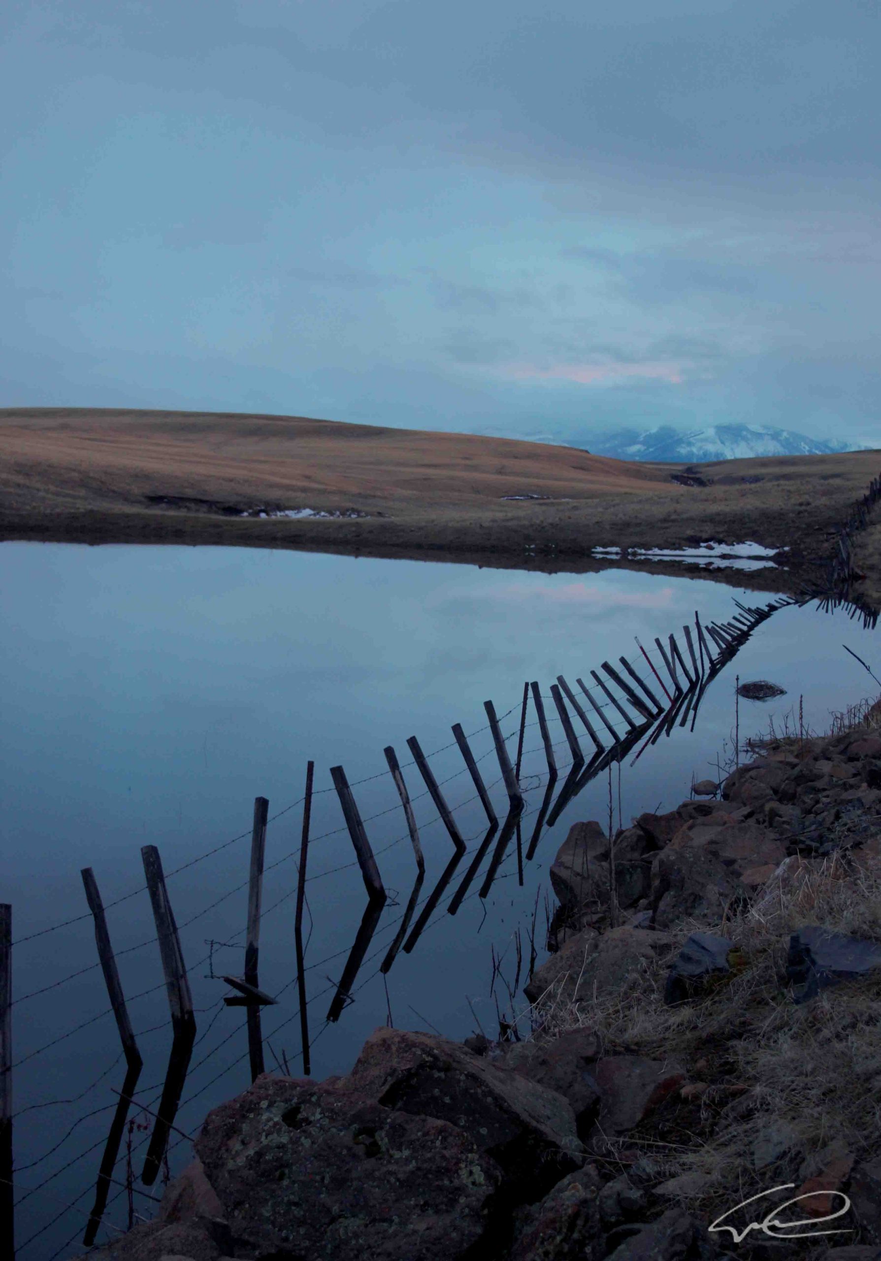
8. Depth (Layers)

Creating depth involves layering elements in the foreground, middle ground, and background to give a sense of three-dimensionality to the image.
Exercise:
- Objective: Capture a scene with multiple layers.
- Steps:
- Find a scene with clear foreground, middle ground, and background elements (e.g., a landscape with a tree in the foreground, hills in the middle ground, and mountains in the background).
- Compose your shot to include all three layers.
- Take the shot.
- Mindful of Color: Utilize color contrast between layers or change in shades of colors to enhance depth.

In this example, the subject is predominantly in the foreground, while the background features layered mountain ranges that create beautiful shades of blue. Image by Pfüderi from Pixabay.
9. Triangles and Diagonals

Using triangles and diagonals can add dynamic tension and lead the viewer’s eye through the composition.
Exercise:
- Objective: Capture a composition using triangles or diagonals.
- Steps:
- Find a scene with natural or man-made diagonals (e.g., stairs, rooftops).
- Compose your shot to highlight the diagonal lines.
- Take the shot.
- Mindful of Color: Use color to accentuate the dynamic lines.

Diagonals are created here by the pattern of trees and the striations on the mountainside. Image by Michael from Pixabay
10. Patterns
Patterns are repeating shapes, colors, or objects that can create a visually engaging image. Breaking the pattern with a contrasting element can add interest.
Exercise:
- Objective: Capture a pattern with a break.
- Steps:
- Find a pattern (e.g., a tiled floor, a row of benches).
- Include an element that breaks the pattern (e.g., a different colored tile, an empty bench).
- Take the shot.
- Mindful of Color: Use color repetition and breaks to create visual interest.

This image showcases a repeating pattern of citrus slices, with one slice in a different color. The color variation creates a focal point, drawing the viewer’s attention. Additionally, many strong compositions incorporate multiple techniques; here, the red slice is strategically placed according to the rule of thirds. Stock Image modified by Eric Demattos CC BY-NC-SA (Attribution Non Commercial ShareAlike)
Tips for Success
- Experiment with Different Times of Day: Lighting conditions can significantly impact how colors appear. Experiment with shooting at different times of day to see how it affects your color relationships.
- Use Post-Processing Tools: Use photo editing software to enhance the colors and contrast in your images. This can help you achieve the desired effect and make your colors pop. You can also use the crop tool in photo editing software to adjust compositions, such as making things fit into rule of thirds or cutting out distraing parts of an image.
- Observe and Learn from Others: Study the work of other photographers to see how they use color in their compositions. This can provide inspiration and help you develop your own style.
By mastering these composition techniques and understanding how to use color, you can create more dynamic and visually appealing images. Practicing these exercises will help you develop a keen eye for composition and improve your ability to use color effectively in your photography.

