Color Relationships
Analogous Colors

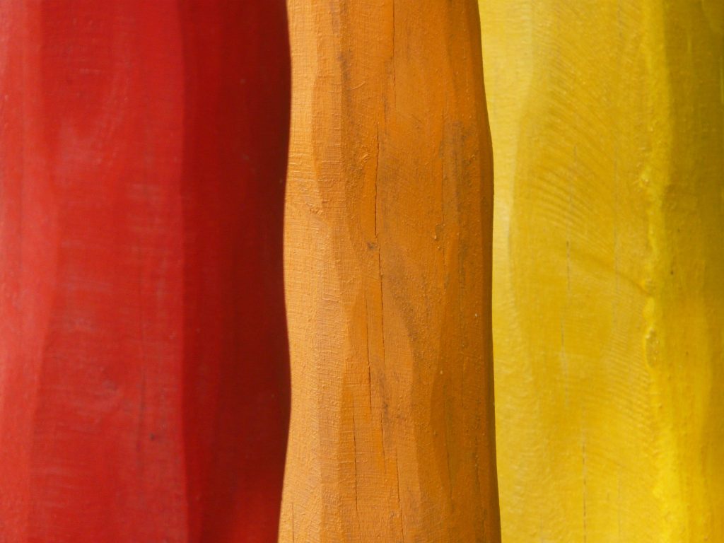
Analogous colors are groups of three colors (though it can be just two colors as well, but it creates less of a visual impact) that are next to each other on the color wheel. They usually match well and create serene and comfortable designs. In photography, analogous colors can create harmonious and pleasing compositions that evoke a specific mood or atmosphere.
- Examples: Yellow, orange, and red; blue, green, and yellow.
- Usage: Analogous colors are often found in nature and are great for creating a sense of harmony and unity in your images.
Complementary Colors

Complementary colors are pairs of colors that are opposite each other on the color wheel. When used together, they create a strong contrast and vibrant look. Complementary colors can make elements in your photographs stand out and draw attention to specific areas.
- Examples: Red and green; blue and orange; yellow and purple.
- Usage: Complementary colors are ideal for highlighting a subject and creating a striking visual impact. They are especially effective in compositions where you want to draw attention to a particular subject.
Monochromatic Colors

Monochromatic color schemes use variations in lightness and saturation of a single color. This approach can create a cohesive and elegant look, emphasizing texture and form over color variation. Black and white photography is on version of a monochromatic image. However it can be light and dark versions of any one color.
- Examples: Different shades of blue; varying tints and tones of green.
- Usage: Monochromatic colors are excellent for creating a unified, soothing composition. They can emphasize the texture, shape, and pattern of the subject.
Practical Exercises
Exercise 1: Complementary Colors

Objective: Capture a photograph that uses complementary colors to create a strong contrast and make the subject stand out.
Equipment Needed:
- DSLR camera
- A red apple and a green apple (or any other objects with complementary colors)
Steps:
- Find Your Location: Choose a well-lit area, either indoors or outdoors, where you can control the composition.
- Set Up Your Subject: Place the red apple next to the green apple. Ensure they are the main focus of your composition. Be mindful of the background, as colors can interfere with the complementary relationship. A white or black background works well and does not introduce incompatible colors.
- Compose Your Shot:
- There are many compositions that could work for this shot. If you have only two objects in the image, consider putting one closer to the camera and one further to create a change in visual scale.
- Ensure the background does not distract from the complementary color contrast.
- Adjust Your Camera Settings:
- Use Aperture Priority mode (“A” or “Av”) to control depth of field.
- Set a wide aperture (e.g., f/2.8 or f/4) to blur the background and emphasize the apples.
- Take the Shot: Capture several images from different angles and distances to explore how the complementary colors interact.
- Review and Adjust: Check the images on your LCD screen, ensuring the colors are vibrant and the contrast is clear. Adjust your settings or composition as needed.
Exercise 2: Analogous Colors

Objective: Capture a photograph that uses analogous colors to create a harmonious and pleasing composition.
Equipment Needed:
- DSLR camera
- A scenic location with a sunset (or another setting with analogous colors, such as a garden with various flowers)
Steps:
- Find Your Location: Choose a location where you can capture a sunset or another scene with analogous colors (e.g., yellow, orange, and red).
- Set Up Your Camera:
- Switch to Aperture Priority mode (“A” or “Av”).
- Set a mid-range aperture (e.g., f/8) to ensure both foreground and background are in focus.
- Compose Your Shot:
- Be sure to consider composition in your image. One idea is to use the rule of thirds to place key elements in the frame.
- Include elements that showcase the analogous colors, such as the sky, trees, or water reflecting the sunset.
- Adjust Your Camera Settings:
- Set a low ISO (e.g., ISO 100 or 200) to reduce noise and capture clear details.
- Adjust the white balance to emphasize the warm tones of the sunset, or use auto white balance for a neutral light tone.
- Take the Shot: Capture several images at different stages of the sunset to see how the colors change and interact.
- Review and Adjust: Check the images on your LCD screen, ensuring the colors are well-represented and the composition is harmonious. Adjust your settings or composition as needed.

